Flofresh Toothpaste
Retail Branding Campaign
Project Description
The Flofresh logo barrows inspiration from other toothpaste logo designs. Most notably in the typeface, gradients, and color pallet in an effort to fit within the toothpaste logo family.
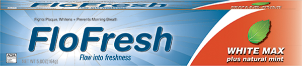
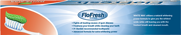
The product design was intended to make the package stand out in the toothpaste aisle. The logo was created first and became the reference point to how the rest of the product was going to be designed
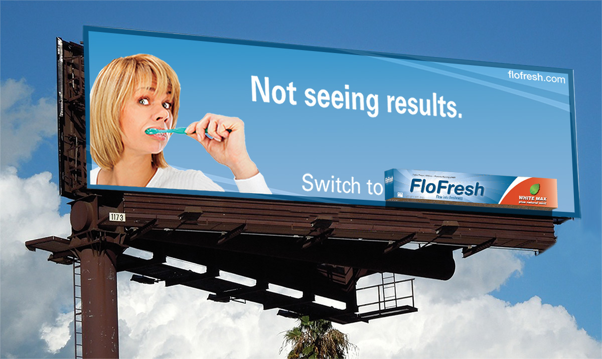
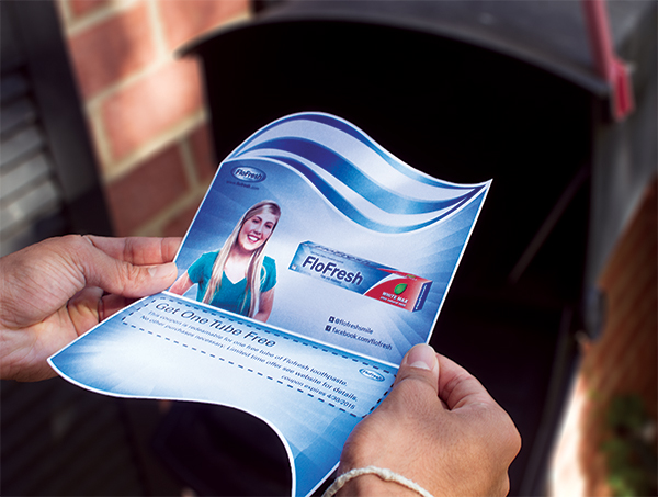
A four panel mailer was also created for this project that utilized a die cut to mimic a toothpaste swoosh. The mailer uses the same toothpaste design rules as the logo and package to make them all cohesive.